


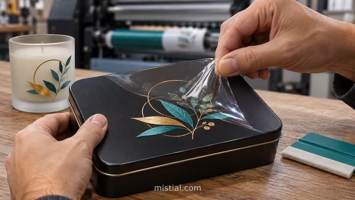
A logo that looks razor-sharp on a client’s PDF proof can still peel up on the bench when a print operator pulls back the carrier film from a matte black gift tin. When that happens, the blame usually lands on the adhesive or the blank. In practice, the failure is often baked into the artwork file before a single drop of ink hits the film.
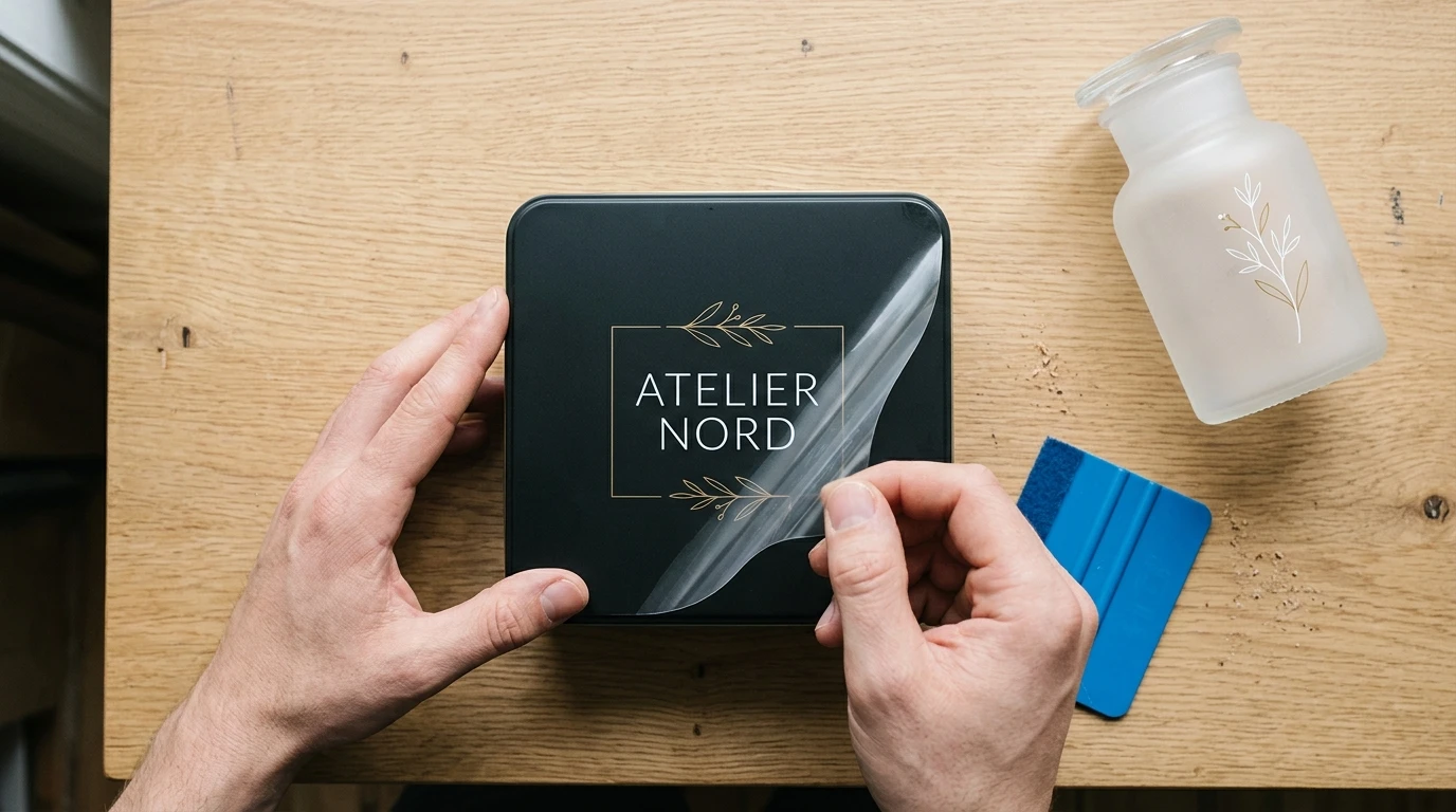
Clean release of fine typography and line art depends on sufficient adhesive contact area and controlled white underbase registration.
UV DTF (ultraviolet direct-to-film) works by printing cured ink layers onto a dedicated release film, laminating it with a transfer carrier, and pressing the finished graphic onto a rigid surface by hand. Because there is no heat press melting a polymer into fabric fibres, the bond depends entirely on the surface contact area of each isolated printed element and how evenly pressure is applied during transfer. That physical reality changes what counts as “print-ready” artwork for gift shops and commercial print counters.
Adhesive Footprint Matters More Than Screen Resolution
Designers who come from paper litho or wide-format vinyl are used to thinking in DPI. A 300 DPI file with 0.3 mm hairline serifs or tiny scattered dots prints cleanly on coated paper because the paper absorbs or holds the ink across a continuous sheet.
On a UV DTF transfer, every disconnected dot, full stop, or thin stem is an independent island of cured ink and adhesive. When the operator rubs the transfer onto a frosted glass jar or powder-coated tin and peels back the clear carrier film, the carrier exerts a slight upward pull. If an isolated element has too little adhesive area touching the object relative to the peel force of the carrier film, it stays on the film instead of transferring—or lifts at the corner a day later.
Print shops that run rigid customisation consistently solve this by setting minimum stroke and island thresholds at the intake stage rather than arguing over rejected batches later. Exact minimums vary with the specific film, adhesive formulation, and surface texture, so shops should verify their own floor on actual stock, but the structural rule is straightforward: thicken fragile hairlines, connect floating micro-accents where the design allows, or place ultra-fine text inside a subtle solid badge or backing shape so the adhesive acts as one continuous footprint.
Dark and Transparent Blanks Expose White-Underbase Errors
Light, opaque white ceramics hide a multitude of pre-press shortcuts. Dark matte tins, smoked glass, and clear acrylic plaques do not.
On dark rigid items, UV DTF relies on a white ink layer beneath the colour pass to keep colours from looking muddy. If the white layer extends even a fraction of a millimetre beyond the colour edge, the finished graphic shows a pale chalky outline—commonly called a white halo—that is immediately obvious against a black or navy surface. In RIP software, operators counter this by applying a slight white choke (shrinking the white underbase inward relative to the colour layer). How much choke is appropriate depends on the printer’s mechanical registration and the fineness of the artwork: too little leaves a halo, while too much causes fine coloured text to lose its white backing and turn dull.
Transparent substrates introduce a second decision that clients rarely think about: which side the viewer sees. If a graphic is applied to the outside of a clear acrylic award or glass candle jar, the back of the transfer—usually the white adhesive side—remains visible through the opposite wall of the object. When a clean two-sided appearance matters, the print shop must check whether the job requires a colour-white-colour layering order (if the specific machine and RIP configuration support it) or whether the design should be simplified so the reverse view looks intentional rather than unfinished.
Surface Texture and Geometry Change How Artwork Behaves
Not every “hard” surface accepts a transfer the same way. A gloss glazed mug, a lightly textured powder-coated flask, and an untreated wooden keepsake box present very different contact conditions.
On a smooth, non-porous surface, the adhesive makes continuous contact across the entire graphic. On a textured or matte-coated blank, microscopic peaks and valleys reduce the actual contact area. Large solid blocks of ink can trap tiny air pockets if burnished hastily, while thin isolated lines may only touch the high points of the texture. Similarly, on a compound curve or tapered tumbler, wide rigid-feeling blocks of artwork resist conforming smoothly and are prone to wrinkling or edge tension, whereas breaking a wide wrap into narrower, well-spaced elements reduces stress during application.
Equally important is knowing what ordinary rigid UV DTF is not meant to solve. Soft silicone sleeves, flexible plastics that bend repeatedly in use, uncoated porous fabrics, and direct food-contact interiors fall outside standard rigid crystal-label workflows. Catching those substrates during quoting saves both wasted film and awkward returns.
Building a Repeatable Pre-Press Checklist for Print Counters
For gift retailers and print service providers handling dozens of small B2B or personalisation orders a week, checking every file from scratch slows down production. A short, written intake standard—shared with corporate clients and local designers—eliminates most avoidable reprints:
| Check Area | What to Verify in the File | Why It Prevents Bench Failures |
| Minimum line & dot size | Flag fragile serifs, distressed speckles, and tiny punctuation | Ensures each element has enough adhesive footprint to release cleanly from the carrier film |
| Transparency & soft fades | Replace semi-transparent drop shadows or feathered edges with solid tones or halftones | Prevents unpredictable adhesive edges where ink density tapers to zero |
| White underbase & choke | Confirm dark-substrate jobs use an appropriate RIP choke setting | Avoids visible white halos on matte black, dark metal, or coloured glass |
| Clear-object reverse view | Decide front-only vs. double-sided visibility before printing | Prevents an unintended plain white backing showing through clear glass or acrylic |
| Substrate & finish match | Confirm the actual blank material, coating, and curvature | Keeps non-compatible silicone, flexible, or food-contact surfaces out of the wrong workflow |
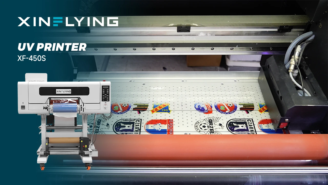
When a shop’s order volume grows past occasional one-offs, consistent registration and white-ink management depend as much on the hardware and film system as on file hygiene. Print service providers comparing commercial roll-to-roll equipment for rigid customisation can review the XINFLYING UV DTF printer range to see how different printhead and film-width configurations align with their typical job sizes.
Before locking in a file rule for a new blank supplier, run a small physical test strip containing the thinnest text, tightest spacing, and darkest colour block you expect to sell, apply it to the actual item, and inspect the edges after letting it settle. A ten-minute bench check on one sample blank costs far less than reprinting fifty gift tins because a client’s typeface looked fine on a backlit monitor.
